NeuroFlow
Sit with the thing you want, until it gets boring
Product Design · Behavioral Science · Build · 2026
What it is
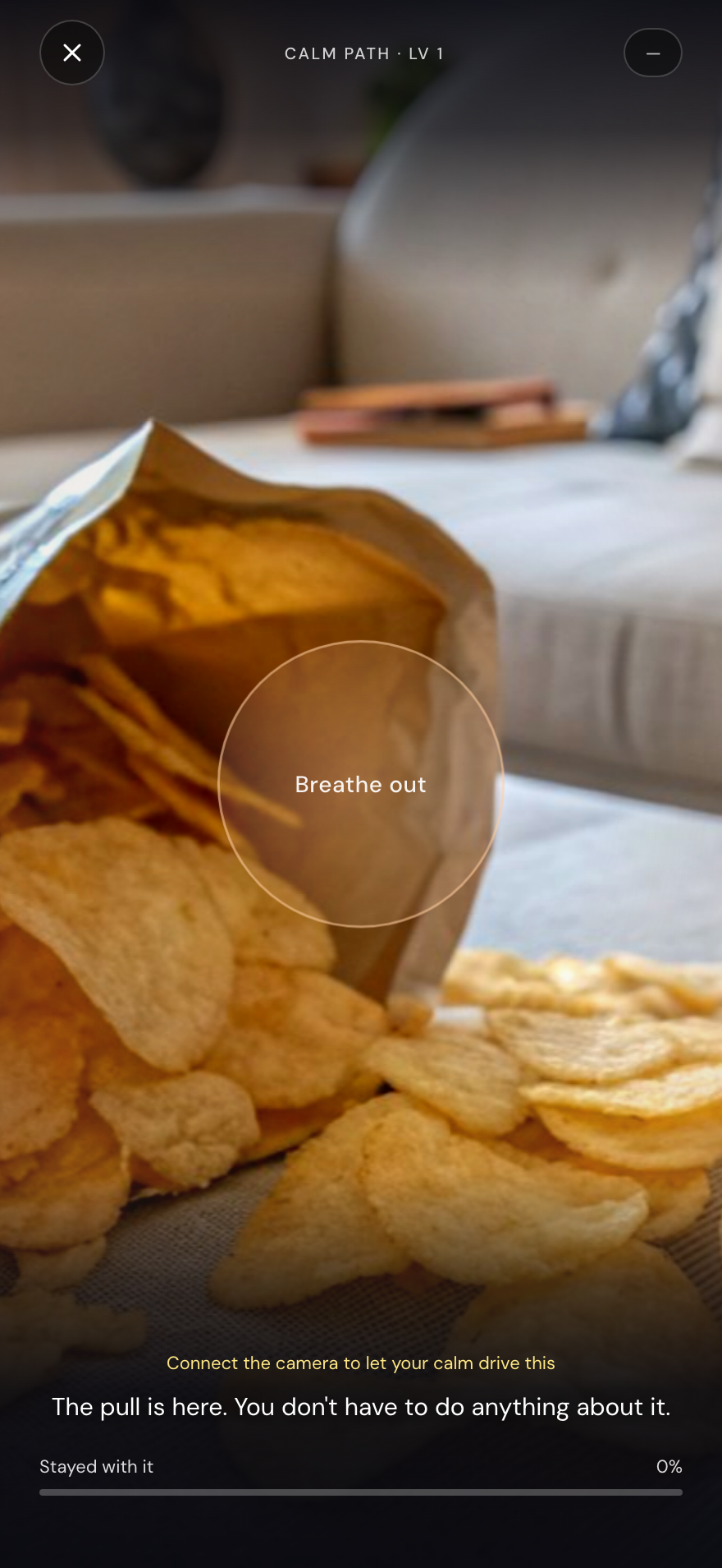
A cue-exposure trainer. You pick something that pulls at you, a bag of crisps, a glass of wine, a phone lighting up, and the app holds it on screen while a breathing pacer runs underneath. Nothing to resist and nothing to do. The session ends when the image has lost its charge rather than when you have won something. Camera-based biofeedback can drive the pacing when it is connected, and the whole thing runs without it when it is not.
Problem
Resisting a craving is the one strategy that reliably fails.
Most products built around a habit ask you to hold out: a streak to protect, a counter that resets, a moment where you beat the urge. That framing makes the urge the opponent, and it means every lapse reads as a personal failure. Cue-exposure research points the other way. A cue met repeatedly without the usual response gradually stops predicting it. Nothing has to be resisted; the pull just has to be allowed to run out.
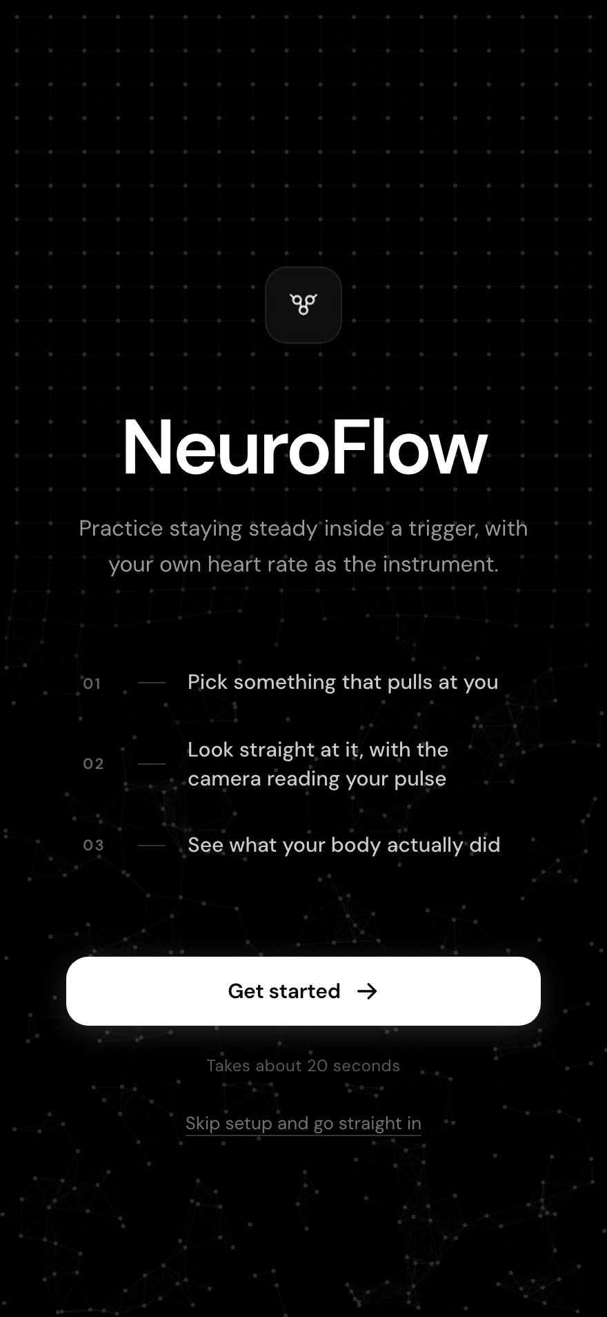
The whole method, on the first screen
Pick something that pulls at you. Look straight at it, with the camera reading your pulse. See what your body actually did. No account, no setup required, and a second link straight past the setup for anyone who does not want it.
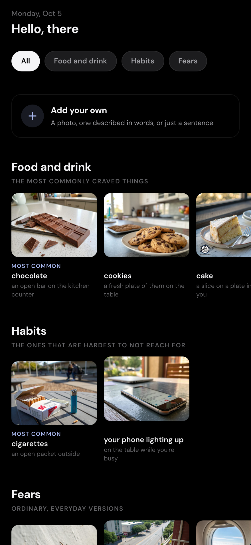
Ordinary cues, not stock photography
Food and drink, habits, and fears, each image generated as the actual situation rather than a product shot: an open bag on the sofa, a packet outside, a phone lighting up while you are busy. The specificity is the point, because a cue only works if it looks like your cue.
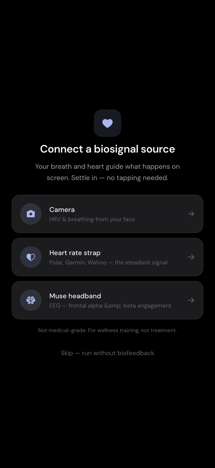
Three ways in, and a door out
Camera for heart rate and breathing from the face, a chest strap for the steadiest signal, or a headband. Underneath all three sits the quiet exit: run without biofeedback. Gating a calming exercise behind a camera permission loses the person who needs it most.
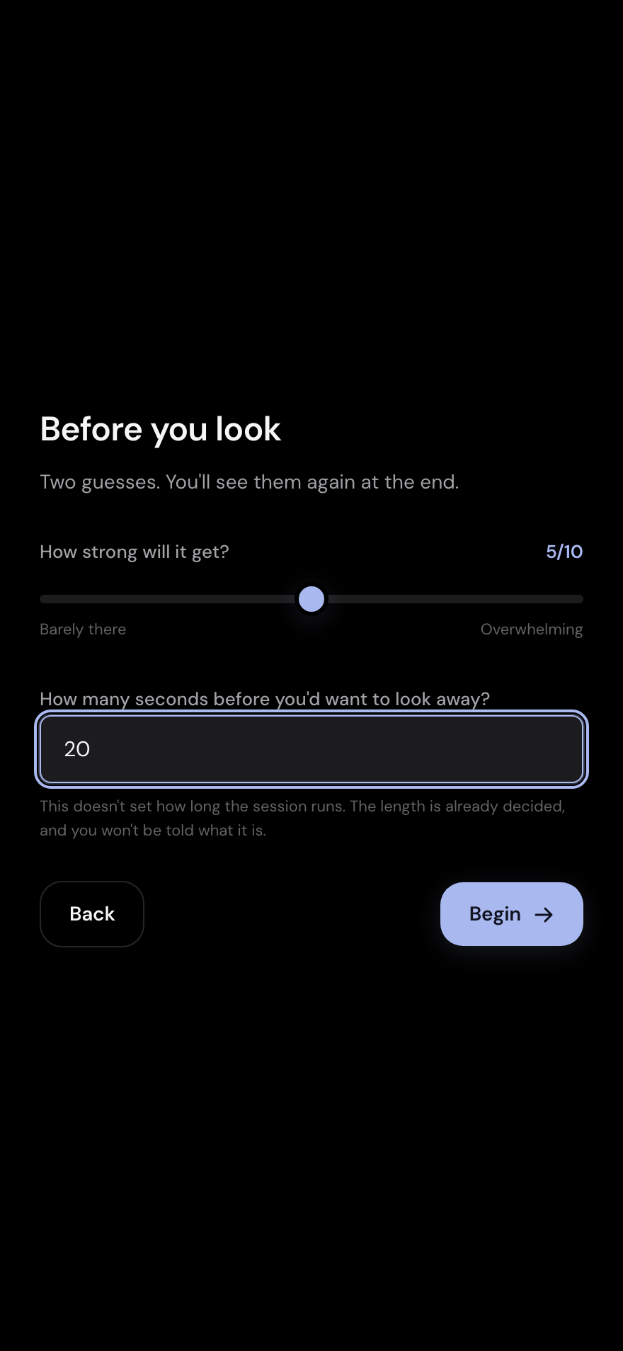
Two guesses, before you look
How strong will it get, and how many seconds before you would want to look away. Both come back at the end against what actually happened. It is the only measurement in the product, and the one people are usually wrong about in a useful direction.
The session
Settle, look, and let it get boring
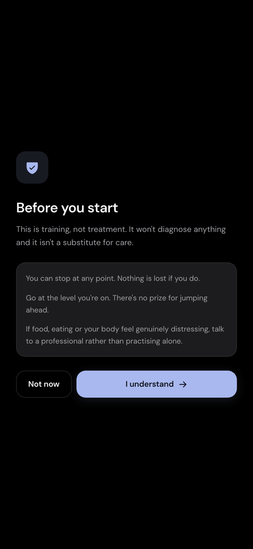
Before you start
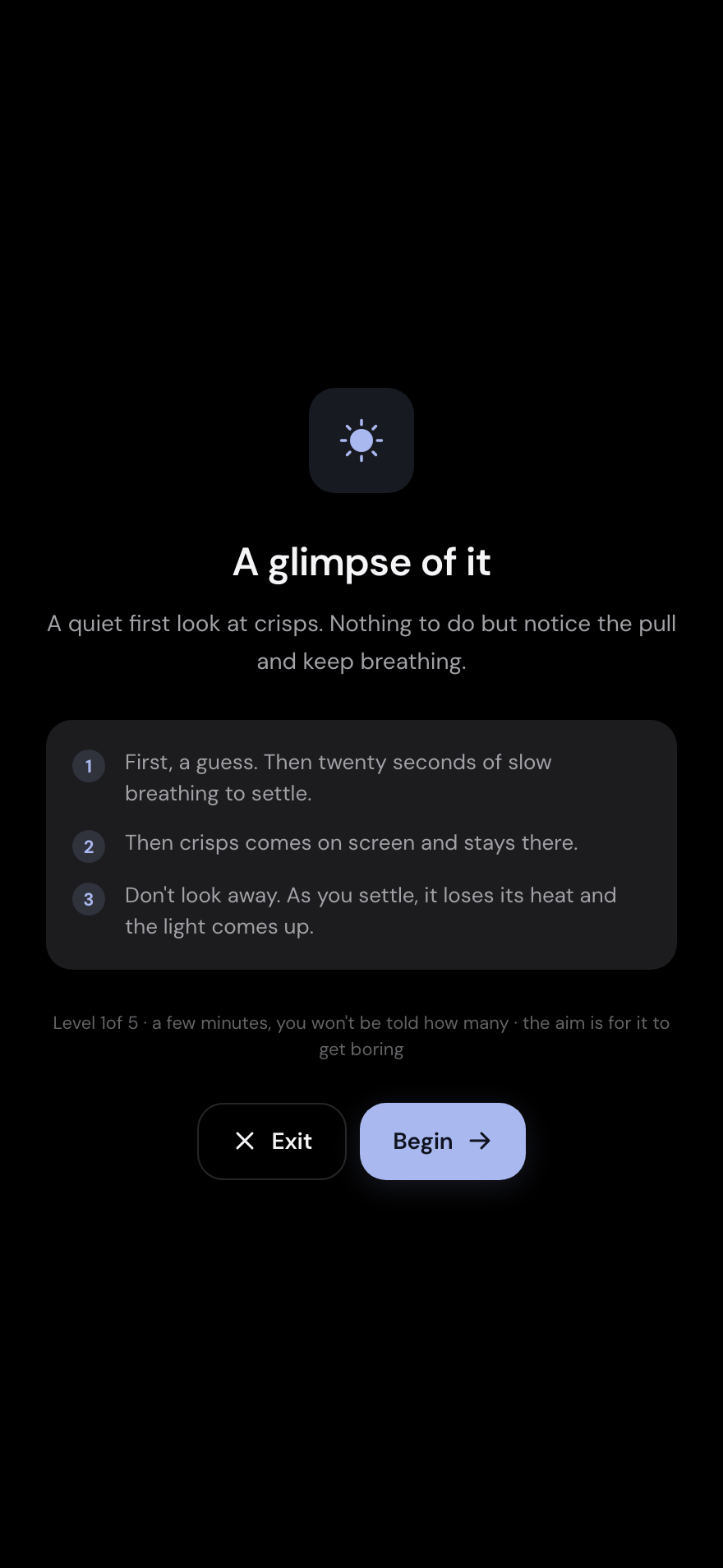
A glimpse of it
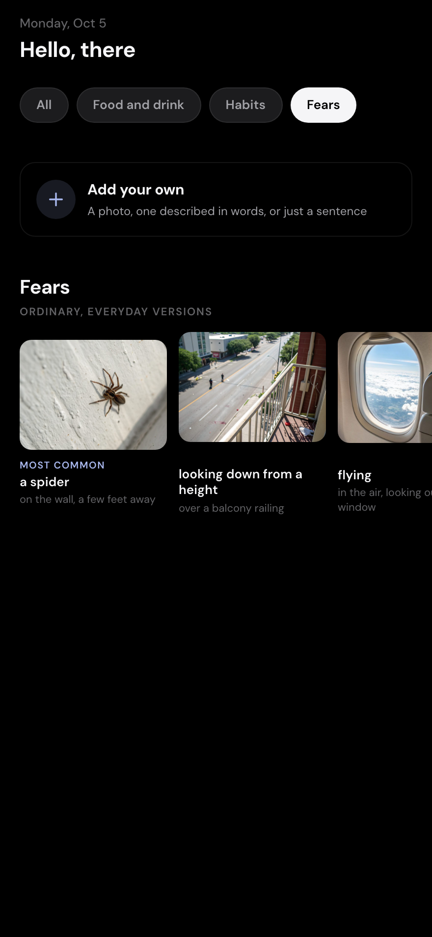
Fears, everyday versions
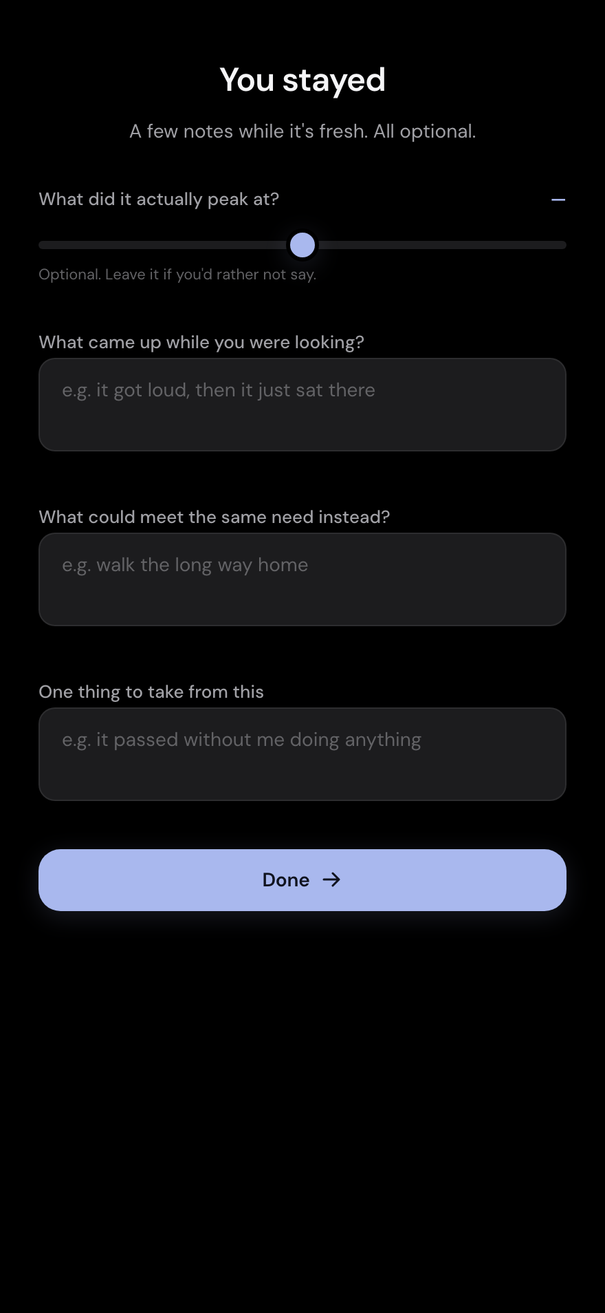
You stayed
Key Insight
The aim is for it to get boring
Every design instinct for a habit product pushes toward making the moment feel like an achievement, because achievement is what keeps people opening an app. This one had to resist that, because the mechanism depends on the cue becoming uninteresting. A session that felt like a win would be teaching the opposite lesson. So the reward surface is almost empty: a progress bar labelled 'stayed with it', no score, and an ending that arrives when the image has lost its heat rather than when you have earned something. Even the closing screen refuses to congratulate. It says 'you stayed', asks what it actually peaked at against the guess made beforehand, and leaves three optional boxes: what came up, what could meet the same need instead, and one thing to take from this.
Stack & Tools
AI
design
code
infra
Next
LifeOS
Open question
Does an image of a trigger pull the same way the real thing does, and does sitting with it on screen take the heat out of it?
What the data shows
Each session takes two guesses before it starts, how strong it will get and how many seconds before you would look away, and shows them against what happened. Across sessions those two numbers are the data.
What it does not
An image on a phone is not a bag of crisps on the sofa. Whether anything here transfers to the moment it matters is the open question, and nothing in the app can answer it on its own.
More client and product design case studies at hannadevries.com