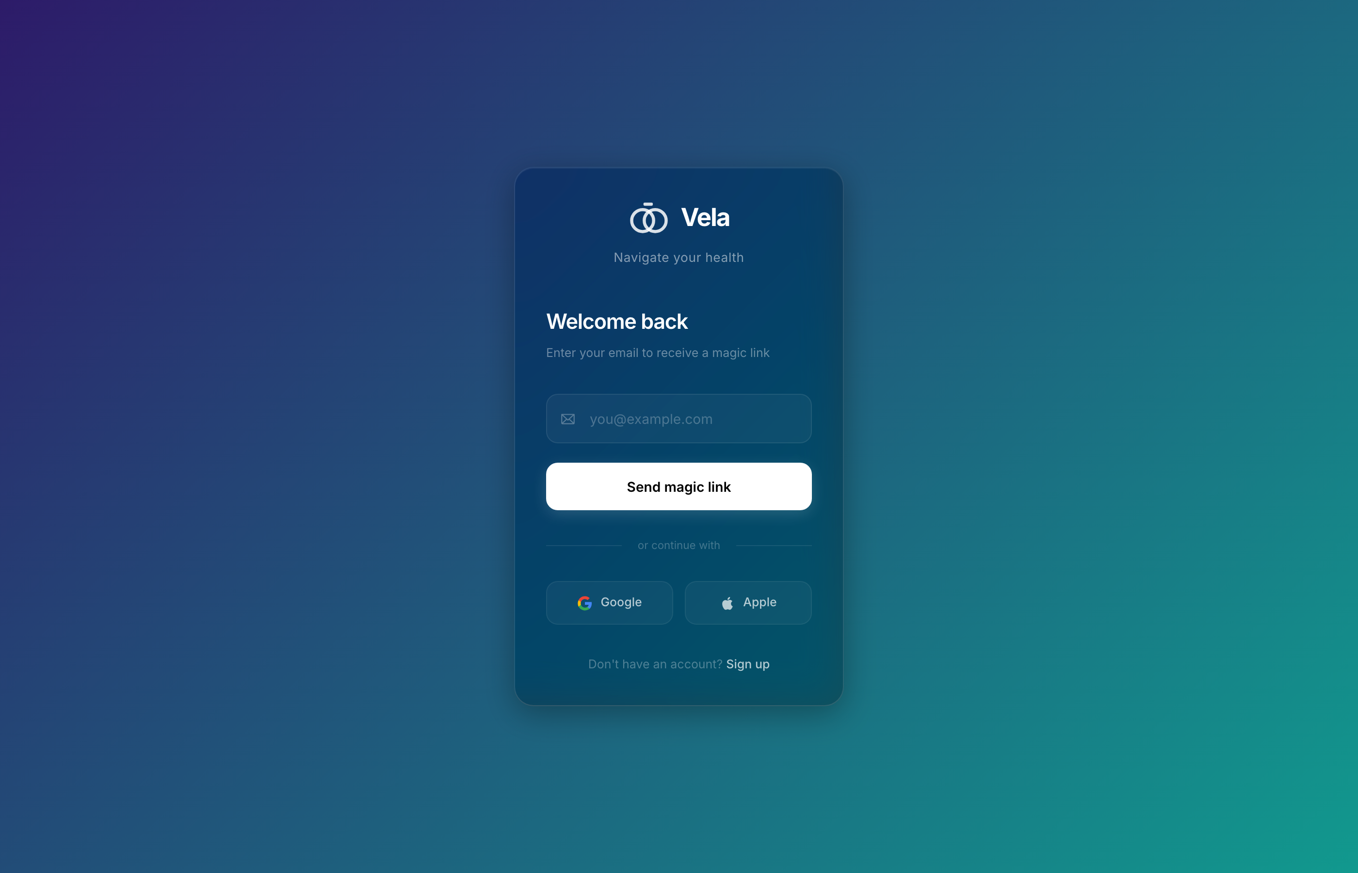
How do you let one partner see the other's body data without it feeling like surveillance?
The partner view is the whole product — but a faithful mirror of someone's biometrics reads as voyeuristic, not caring. I redesigned this screen six times before the reframing landed: every metric is verbed for the viewer, not just shown.
Hanna · Apr 7
Full health snapshot
28
HRV
52
RHR
+0.3
Temp
D18
Cycle
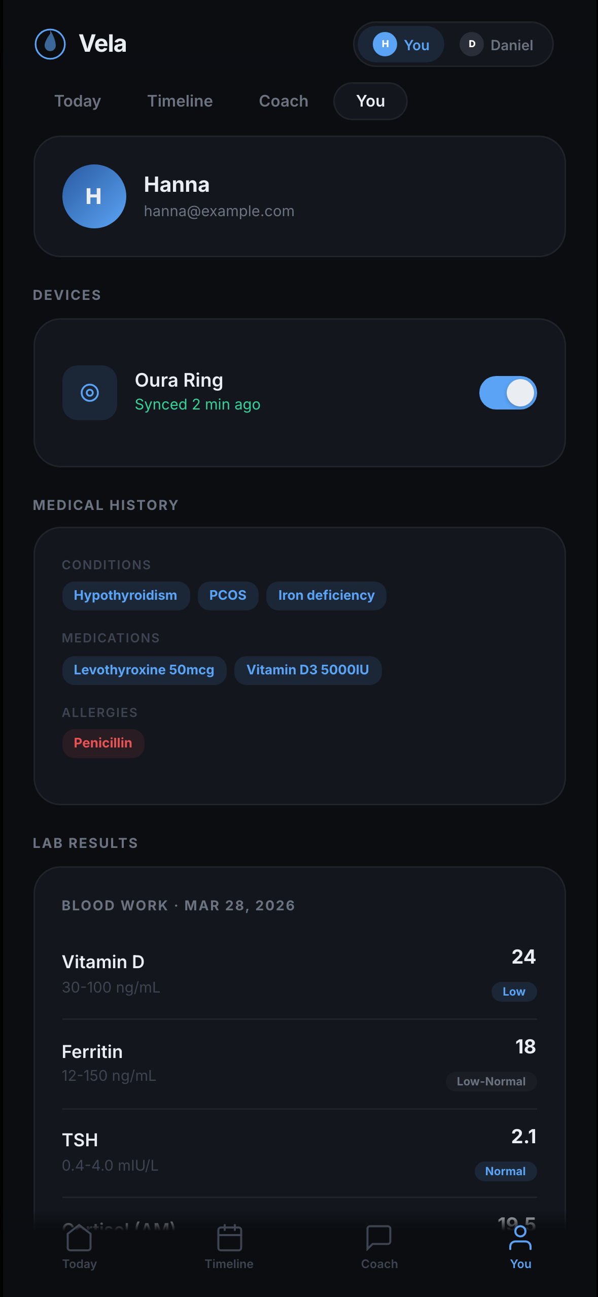
Labs · Mar 28
Medical history
Hashimoto’s · Levothyroxine 50µg · Endometriosis (stage 2)
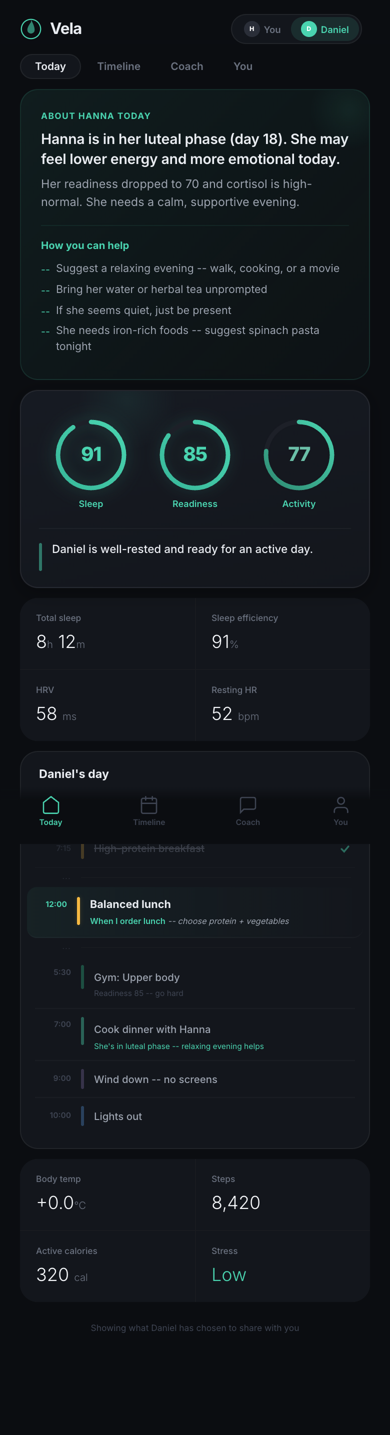
v1 — Faithful mirror
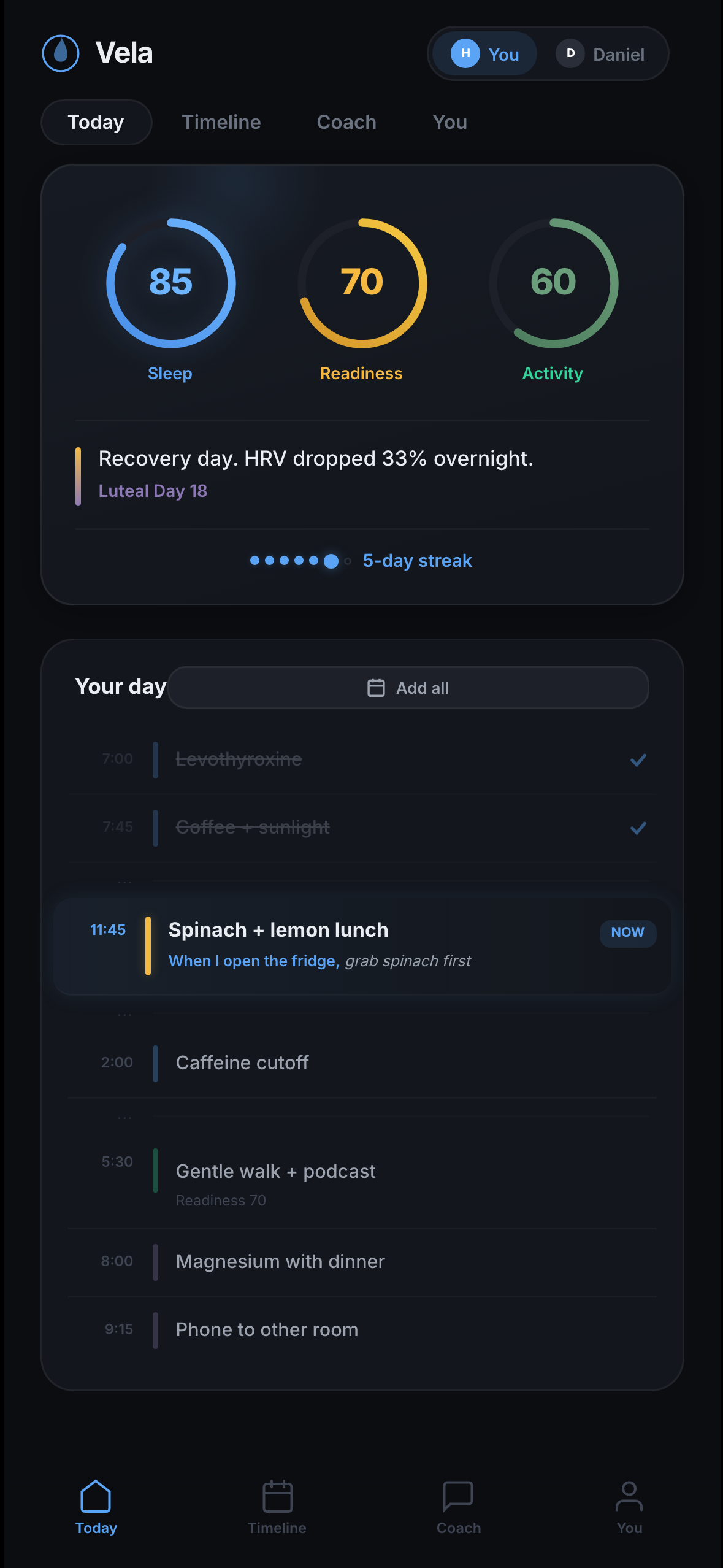
First pass: just surface everything — rings, vitals, labs, medical history — exactly as the owner sees it. Felt like reading someone's chart.
v2 — Mobile dual-view
Moved to mobile, surfaced both partners' rings and a written 'about' summary. More care, but the explanatory paragraph still narrated her body to him.
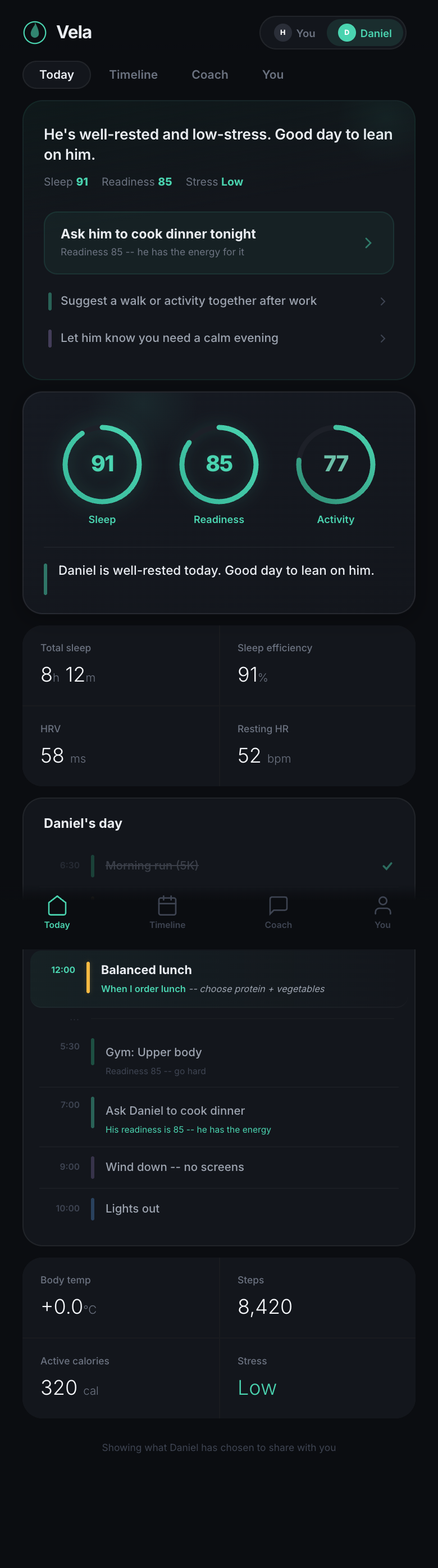
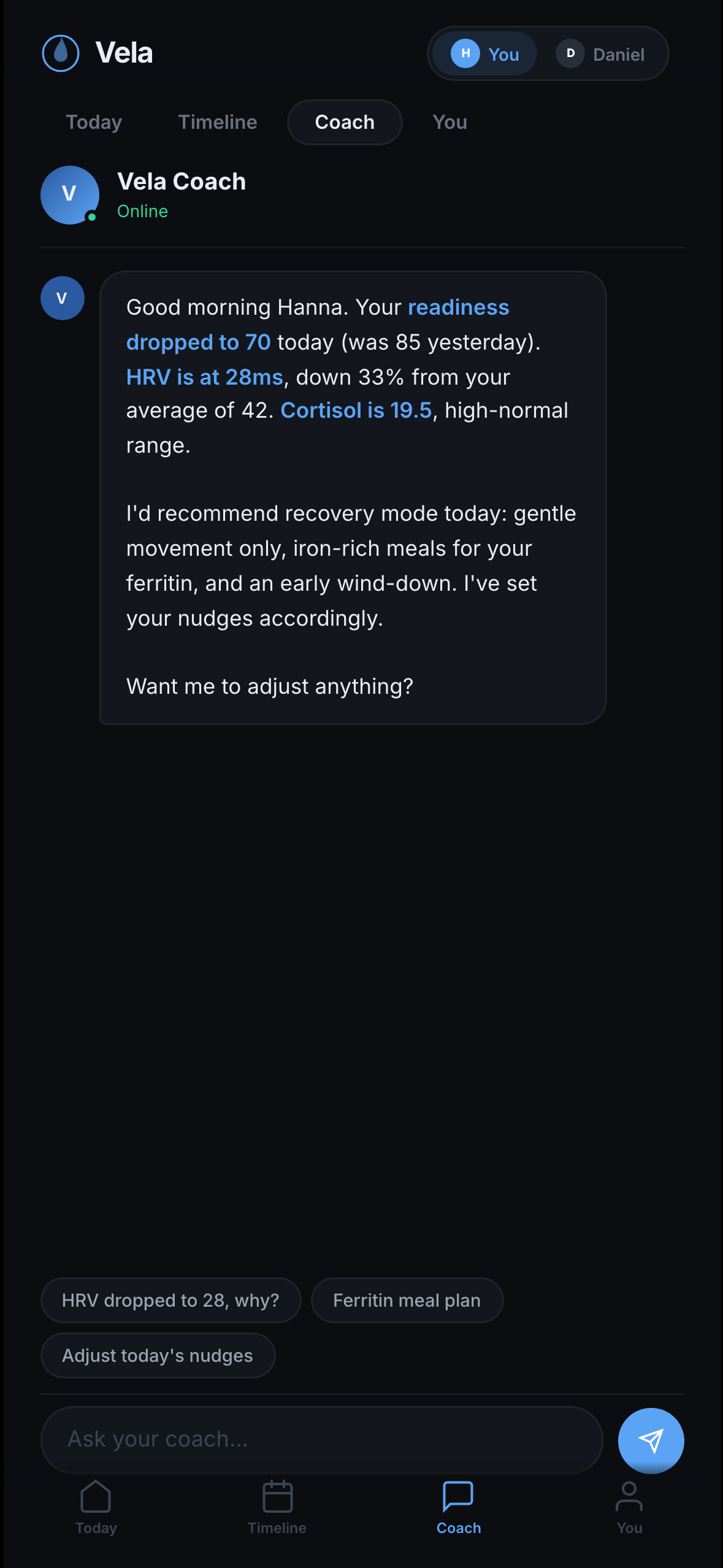
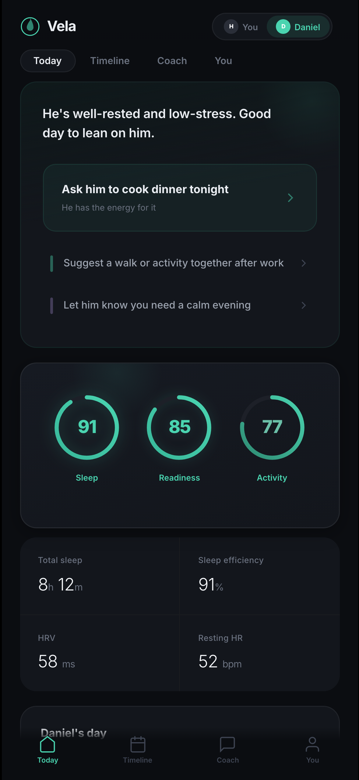
v3 — Action pills · shipped
Every metric is verbed for the viewer. '85 readiness' becomes 'Ask him to cook dinner tonight.' The data is the same — the address changes.
Trade-off
Reframed metrics make the partner view less useful as a longitudinal tracker — you can't easily compare last Tuesday to today. The relationship was worth more than the dashboard.